Crown & Peak Branding
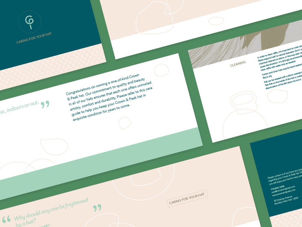
Small Business branding development for a custom milliner. The client has been working at a master milliner's studio and is ready to start her own shop. Her challenge was to attract a younger clientele that are interested in making stylish and unique fashion statements.
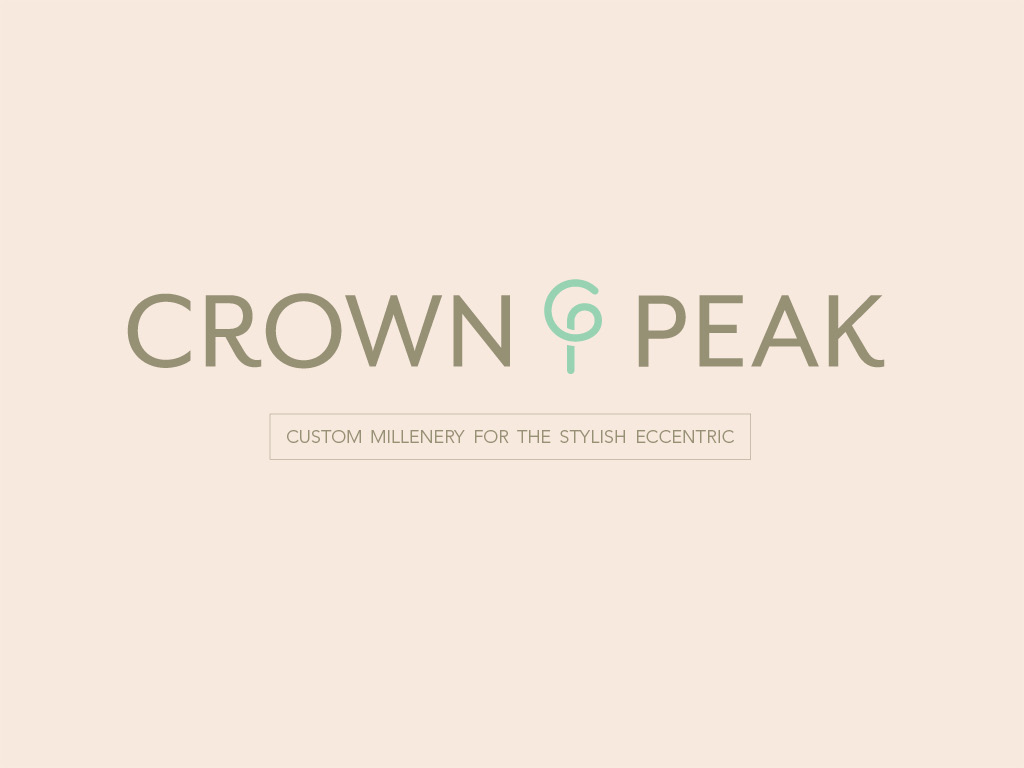
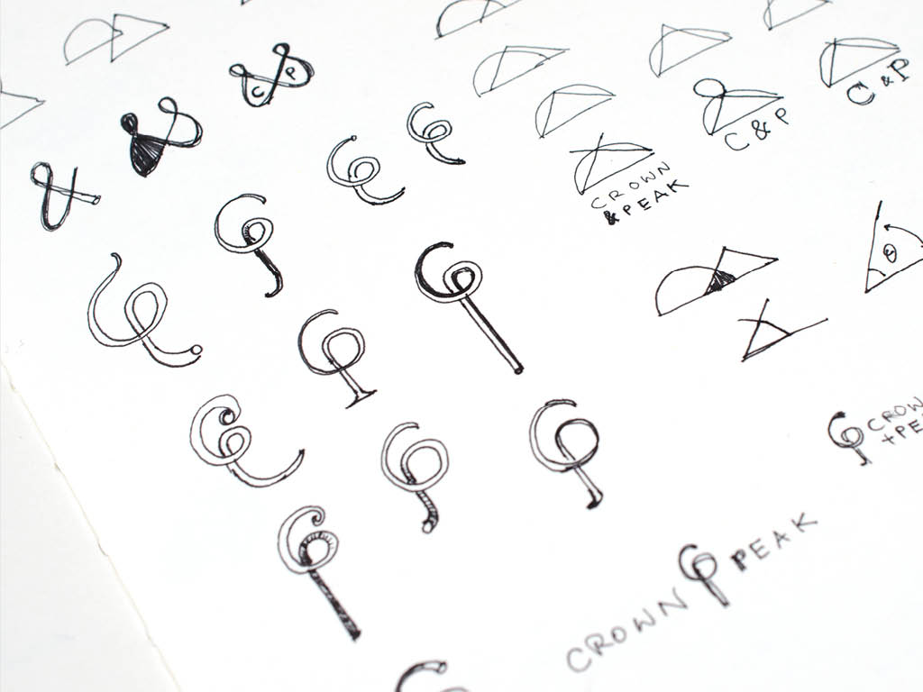
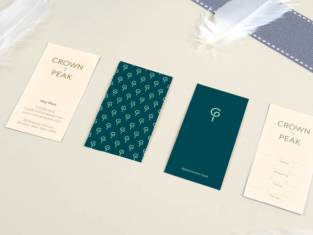
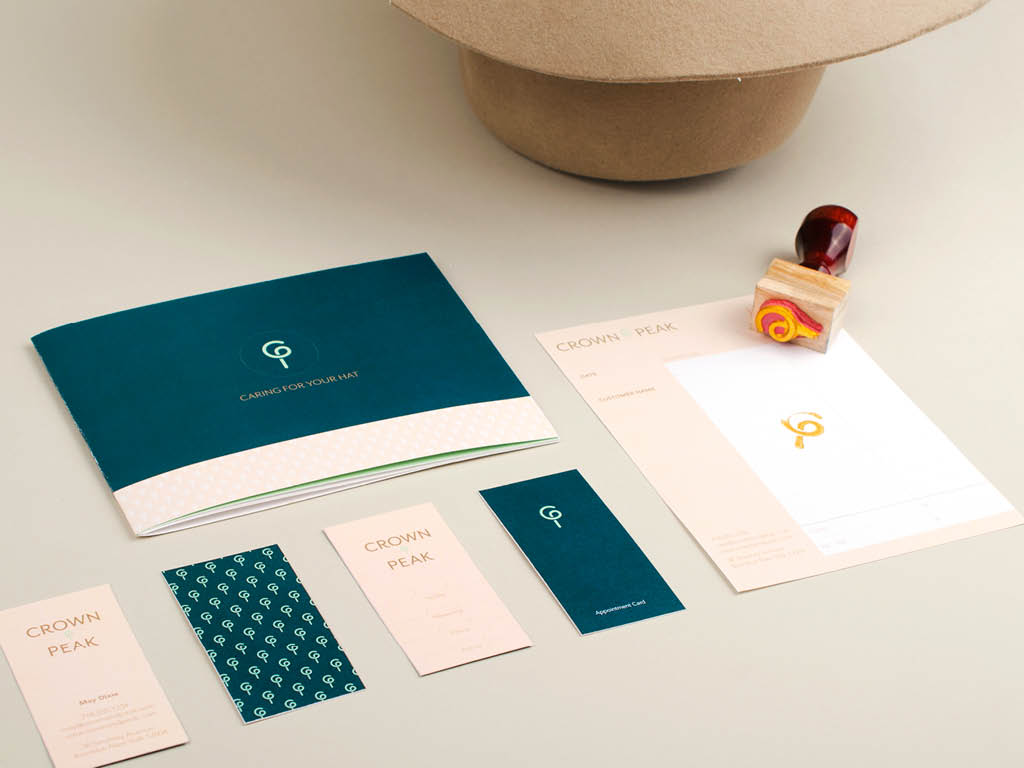
The tone for the design is classical with a quirky twist. The dimensional monogram logo is paired with a vintage color palette. A modified humanist san serif is chosen for the final logo type. Additional abstract illustrations based on hat-making tools are used in stationery and brochures to complement the overall visual language.
Created from a student brief in 2015.
